Address stamps are a simple office tool that helps you save time while sending letters, invoices, packages, and other documents. Instead of writing the same details again and again, you can stamp your address within seconds.
However, a poorly designed stamp can create problems every time you use it. Small design errors can make the text difficult to read or leave important information missing. Since address stamps are made for repeated use, it is important to think about the design before placing your order.
Let us look at the common design mistakes and learn how to avoid them.
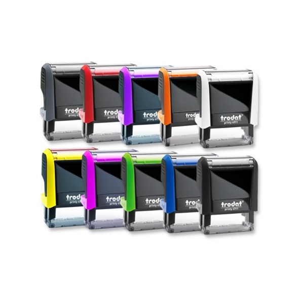
Design Mistakes to Avoid When Ordering Address Stamps
Using a Font That Is Difficult to Read
One of the biggest mistakes is choosing a font that looks attractive but is difficult to read.
Decorative fonts may look good on a computer screen, but they may not produce clear impressions on paper. Thin letters or fancy styles can become blurry after stamping.
Choose a simple and readable font. Standard fonts with clear letter shapes make your address easy to understand. This also helps when your mail is processed or delivered.
Adding Too Much Information
Many people try to include every possible detail on their address stamps.
Adding multiple phone numbers, email addresses, websites, and extra notes can make the stamp look crowded. As a result, the text becomes smaller and harder to read.
Include only the information that is needed. In most cases, your name, company name if required, street address, city, state, postal code, and country are enough.
Choosing the Wrong Stamp Size
The size of the stamp plays an important role in how your address appears.
A very small stamp may force the text into tiny letters. A very large stamp may take up unnecessary space on envelopes and documents.
Choose a size that matches the amount of text you want to include. If your address is longer, select a slightly larger stamp instead of reducing the font size too much.
Ignoring Text Alignment
Some people enter the address without paying attention to how the lines are arranged.
Poor alignment can make the stamp look uneven. It also affects readability, especially if the address contains several lines.
Keep the text centered or left aligned based on the layout provided by the manufacturer. Maintain equal spacing between each line for a cleaner appearance.
Forgetting to Check Spelling
A spelling mistake on a stamp can become an expensive problem because every impression will contain the same error.
Replacing the stamp means spending extra money and waiting for another product.
Read every line carefully before approving the design. Check names, street numbers, postal codes, and city names more than once. If possible, ask another person to review the details.
Using Very Small Text
Trying to fit too much information often results in very small letters.
Although everything may fit inside the design, the printed impression may not be clear. This becomes even more noticeable after regular use.
Keep the font size large enough for comfortable reading. If there is too much information, remove unnecessary details instead of reducing the text size.
Ignoring Ink Color
Many buyers focus only on the stamp design and forget about the ink color.
Some colors may not be suitable for official documents. Light colors can also become difficult to read.
Black and blue are commonly used because they produce clear impressions on most types of paper. Choose another color only if it matches your intended purpose.
Not Leaving Enough Space Around the Text
If the text is placed too close to the edges, the final impression may look cramped.
Some letters may also appear incomplete if the stamp is pressed unevenly.
Leave a small margin around the address. This gives every line enough room and creates a balanced appearance.
Ordering Without Reviewing the Proof
Many people complete their order quickly without checking the final preview.
Even a small formatting issue can affect the appearance of the finished stamp.
Review the proof carefully before confirming your order. Check the spacing, alignment, spelling, and overall layout. Spending a few extra minutes here can help you avoid replacing the stamp later.
Conclusion
A well designed stamp saves time and creates a clean impression on every document. Most design problems happen because of small mistakes that are easy to overlook during ordering.
By choosing a readable font, keeping the information simple, selecting the correct size, checking every detail, and reviewing the final design before placing the order, you can avoid common problems.
Address Stamps are used repeatedly for many years, so taking a little extra time during the design stage can help you receive a product that works well every day.
 Business In Solutions